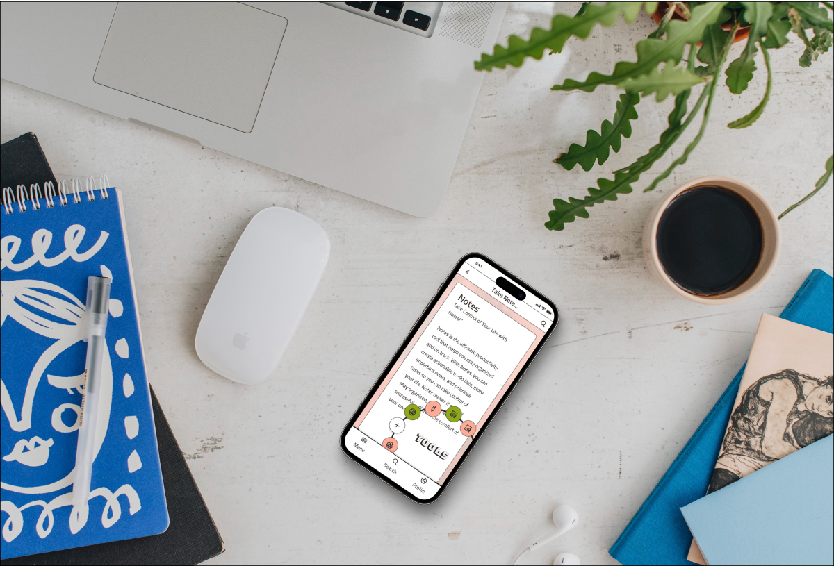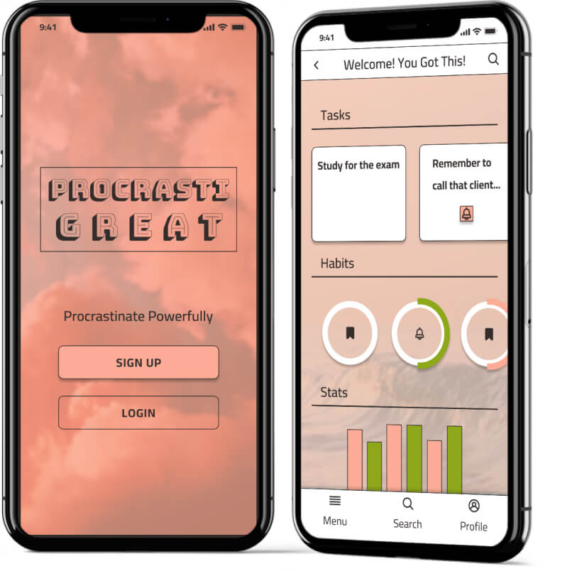
Procrastigreat screens for home and login are shown on two iphone mock-ups.
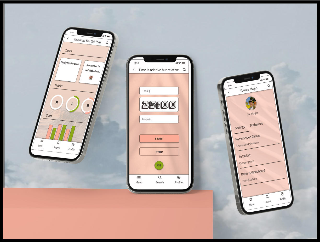
 An seond image of two i-phones with the ProcrastiGreat screens.

Brief & Objectives

Design the UI for the mobile version of a productivity app and prepare for handover to developers.

Requirements

  • User profile
  • Task lists
  • Mark tasks as complete
  • 2-3 new functions based on research

Deliverables

  • Analysis of 2 competing apps
  • Low, mid and high-fidelity mobile screens
  • Screen annotations
  • Visual design inspiraiton board
  • A set of 3-5 icons
  • Typography style sheet
  • 2 color pallete options including HSL, HEX and RGB codes

Audience Research
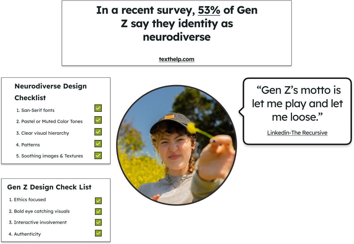
 An image of a Gen-Z person holding a flower with 4 boxes containing the following text. 
                        In a recent survey, 53% of Gen Z say they identity as neurodiverse. Gen Z's motto is let me play and let me loose. 
                        Neurodiverse Design Check-List:San-Serif fonts
                        Pastel or Muted Color Tones,Clear visual hierarchy, Patterns, Soothing images & Textures
                        Gen-Z Checklist:Ethics focused, Bold eye catching visuals, Interactive involvement, Authenticity.

Competitive Analysis

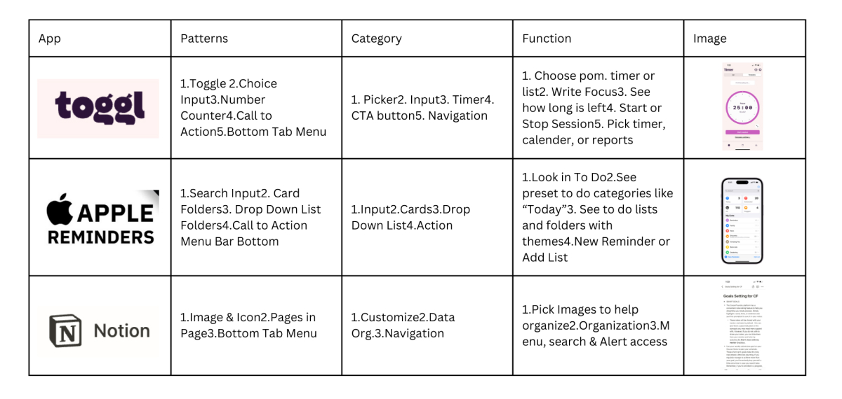
A chart. Horizontal column lables app, patterns, category. Vertical lables under App are Toggl, Apple Reminders, and Notion. Summary: the three apps use design patterns that fit in catagories and have functions that should be reppeated in the ProcrastiGreat App. Functions to reppeat include pomodoro timer with focus write in, to-do lists with themes, notes documents with detailed search and alert access.

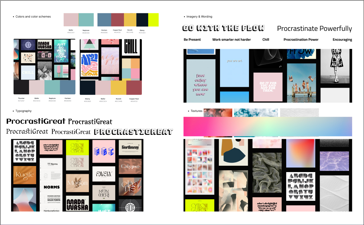
Moodboard

Soft Neo-Brutalism

A moodboard with images, fonts, wording and textures for ProcrastiGreat.
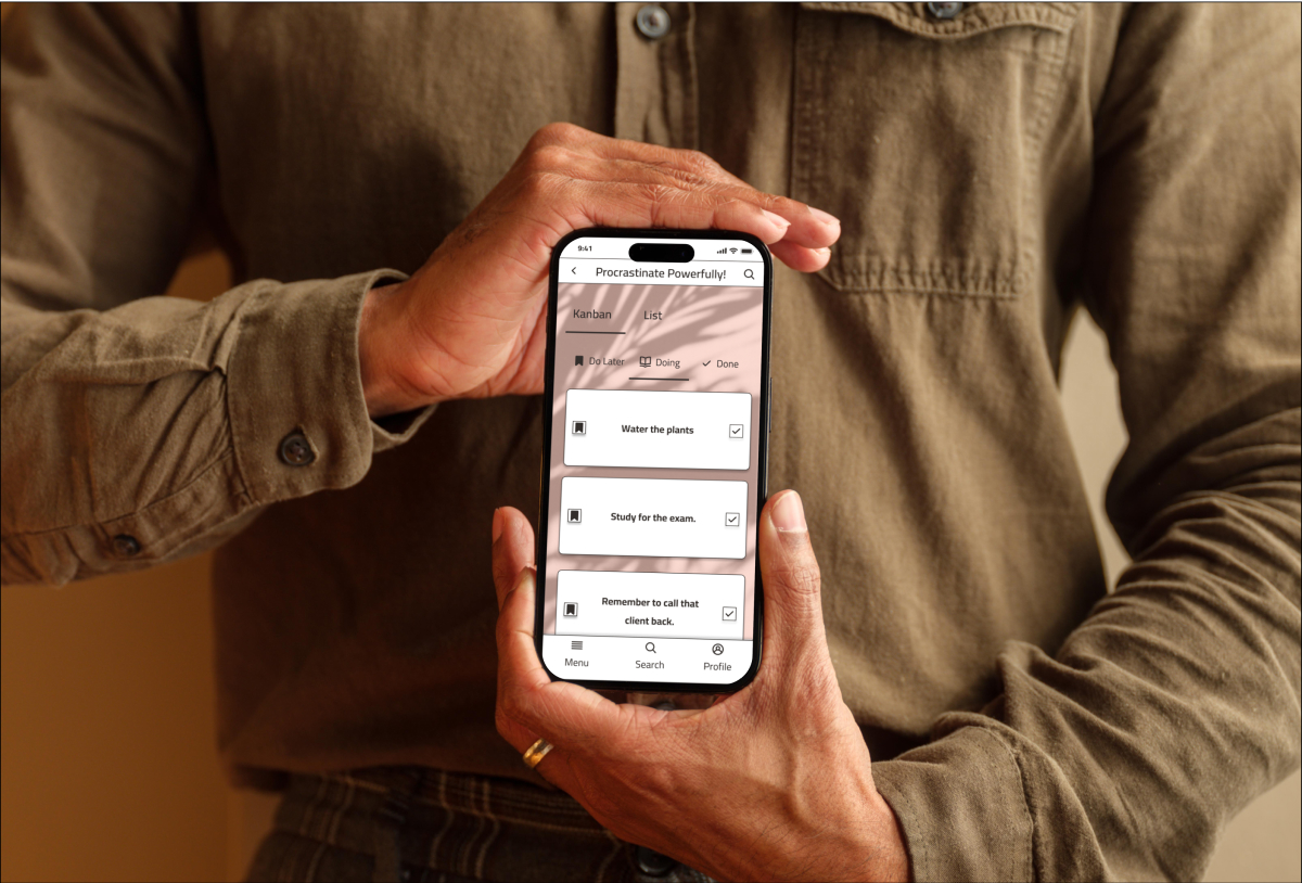
A person holding a phone with the ProcrastiGreat home screen.

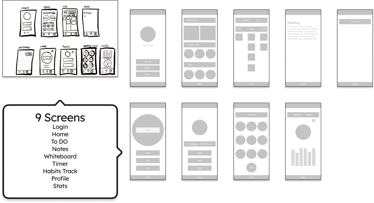
Sketches & Wireframes

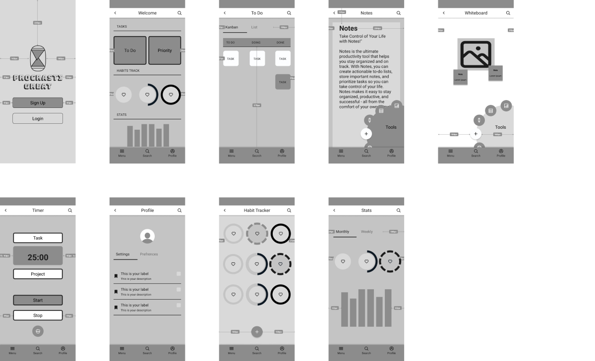
Sketches and mobile wireframes for 9 screens that include login, home, to-do, notes, whiteboard, timer, habits tracking, profile and stats.

Mid-Fidelity With Annotations

8 Mid-fidelity mobile screens with more detail added and annotations.

Type & Color Considerations

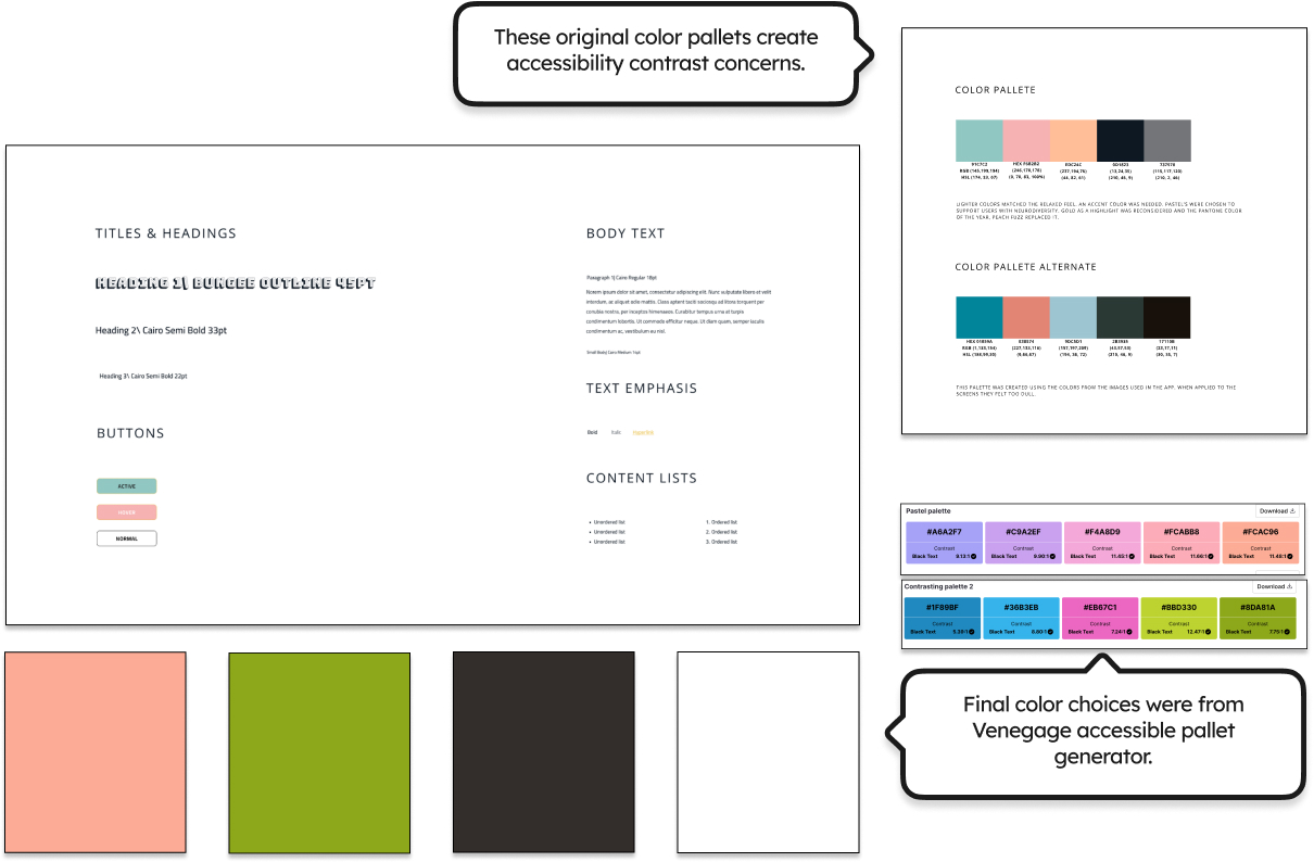
The final color pallete is on the left and the original is on the right. Text notes that the new pallete has stronger contrast for better accessibility and was designed using the Venegage accessible color pallete generator.

Icon Design

Task Completion & Whiteboard Tools
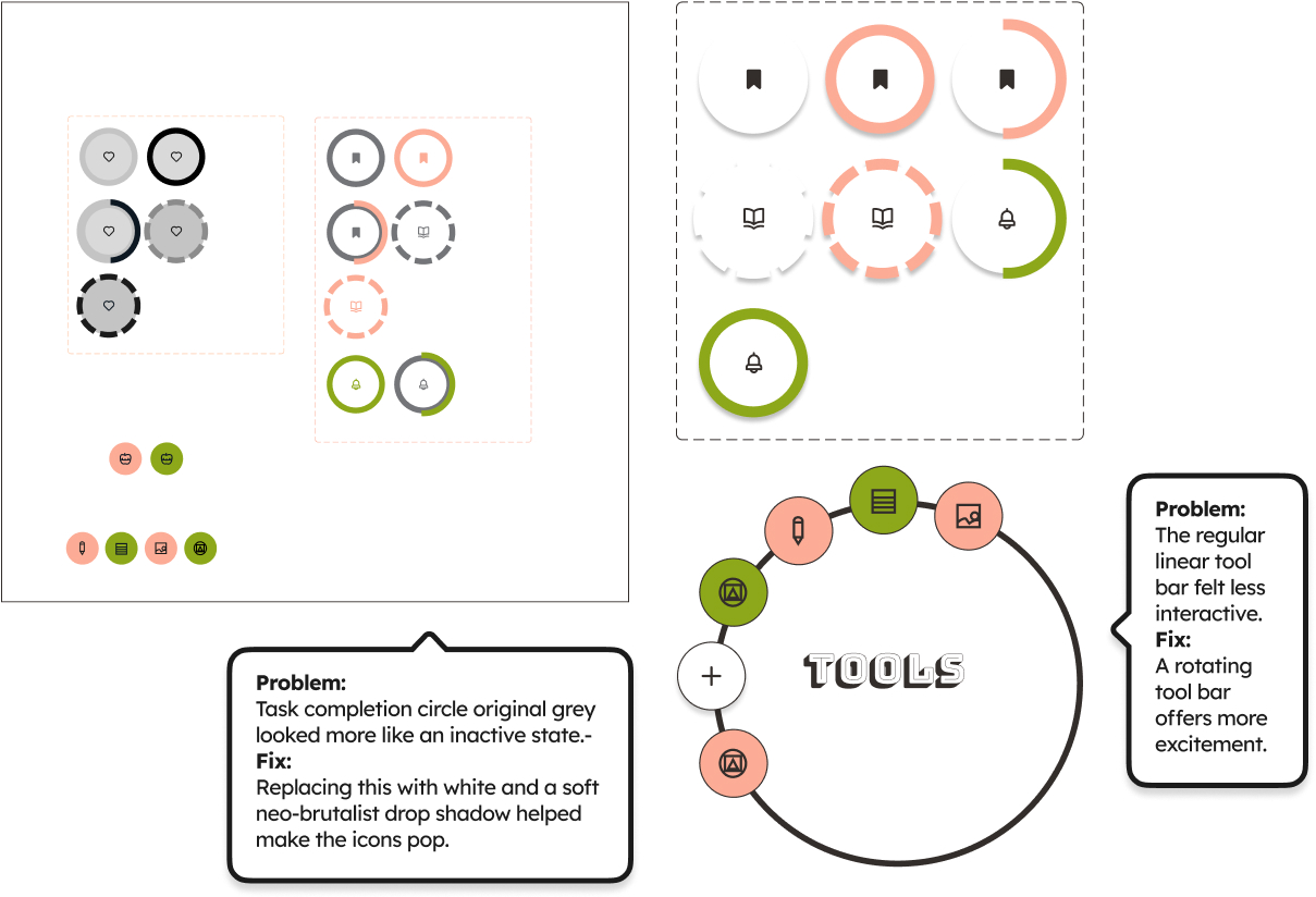
Low, mid and high fidelity versions of procrastigreat icons. Icons are white raised circles with pink and green colors representing visualy the amount of completion for habits that happen once, twice or mutiple times. The tols icons are also raised circles with icons on a rotating tool bar. Text says: Problem:
                        Task completion circle original grey looked more like an inactive state.-
                        Fix:Replacing this with white and a soft neo-brutalist drop shadow helped make the icons pop.
                        Problem:The regular linear tool bar felt less interactive.
                        Fix:A rotating tool bar offers more excitement.
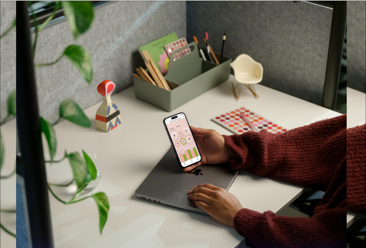
A person sitting at a desk, holds a phone with the habits app screen of Procrastigreat open.

High-Fidelity V1

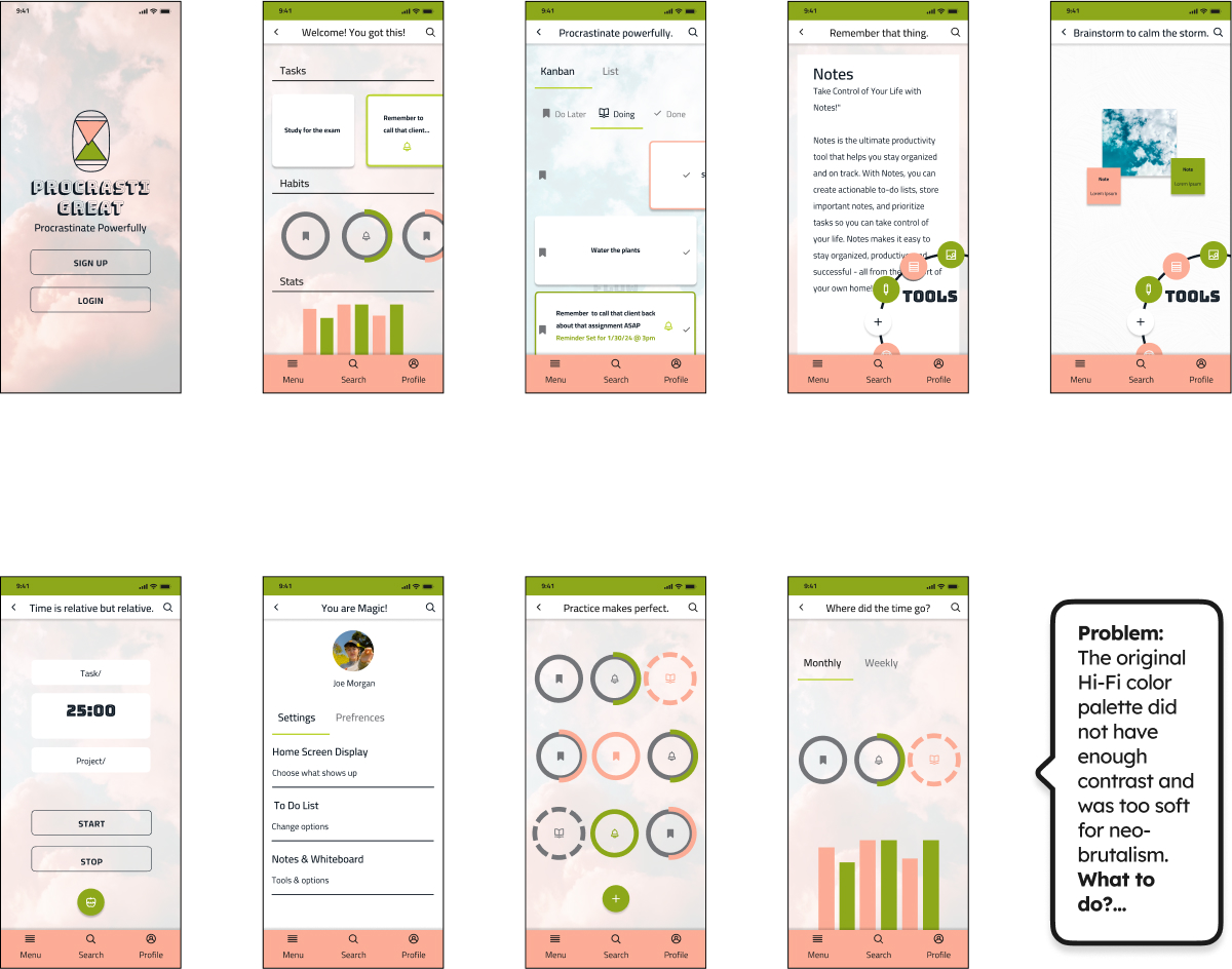
9 High fidelity screens for Procrastigreat with pink green and white accents. Text included: Problem:
                        The original Hi-Fi color palette did not have enough contrast and was too soft for neo-brutalism.
                        What to do?...

Final Style Guide

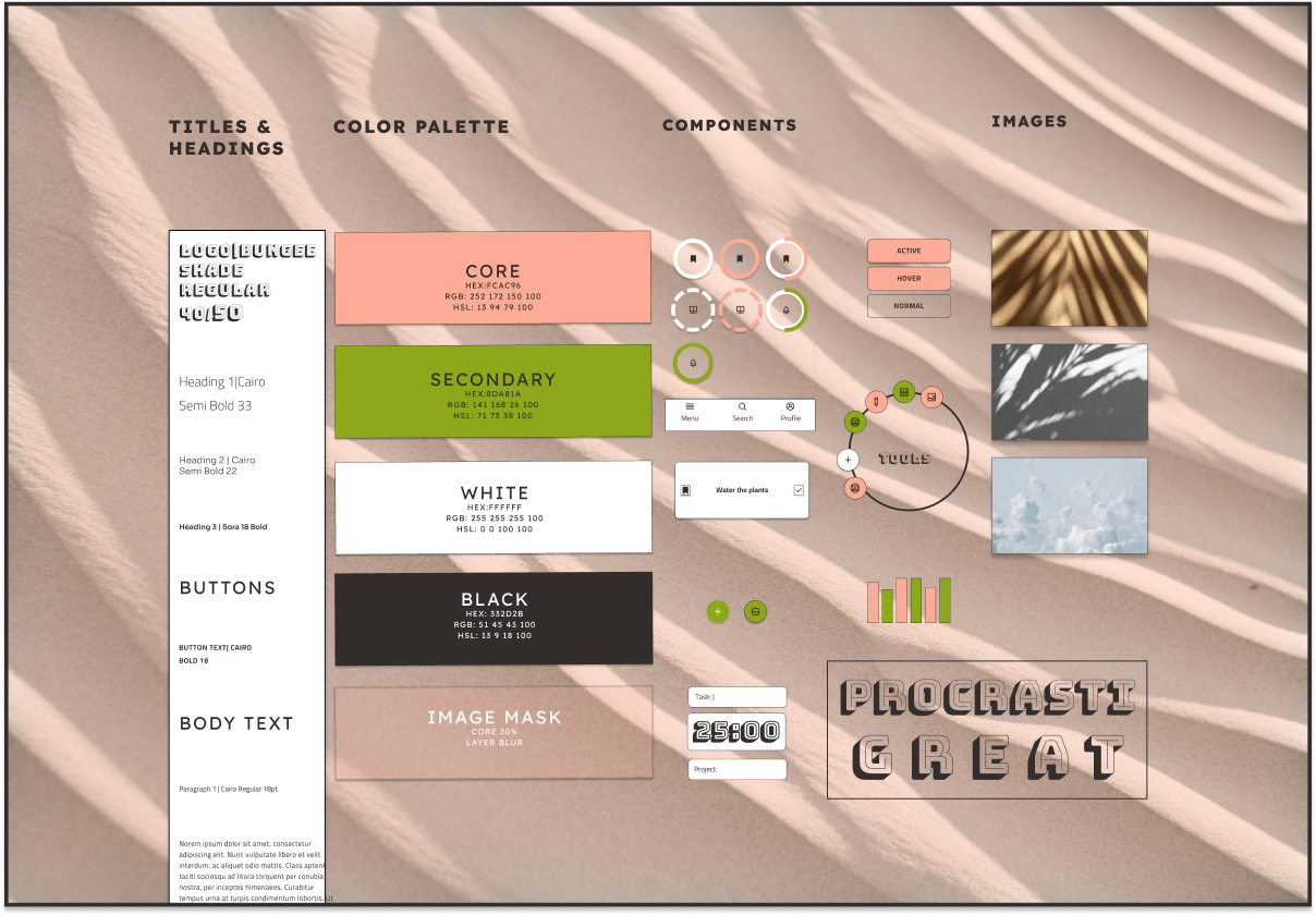
A style guide shows titles, headings, compoments, images and the ProcrastiGreat logo. Colors are pink green white and black with a faded sand background texture. Images are of clouds, and plant shadows on a wall.

Final High Fidelity

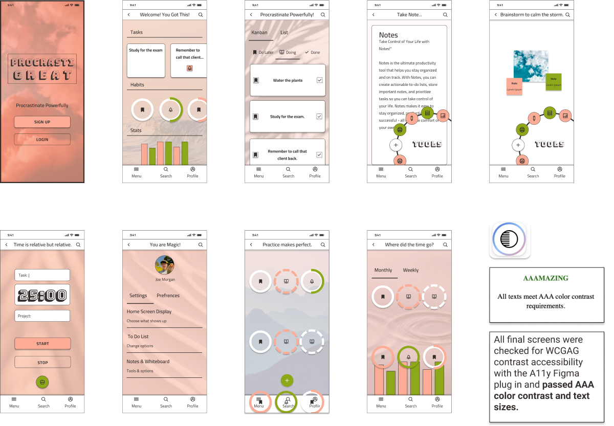
Final version image of high-fidelity screens with more color and type contrast. Text included says: All final screens were checked for WCGAG contrast accessibility with the A11y Figma plug in and passed AAA color contrast and text sizes.

Reflections

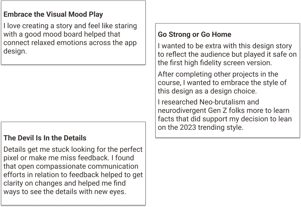
text in outlined blocks:Embrace the Visual Mood Play-
                        I love creating a story and feel like staring with a good mood board helped that connect relaxed emotions across the app design. 
                        Go Strong or Go Home- I wanted to be extra with this design story to reflect the audience but played it safe on the first high fidelity screen version.
                        After completing other projects in the course, I wanted to embrace the style of this design as a design choice. 
                        I researched Neo-brutalism and neurodivergent Gen Z folks more to learn facts that did support my decision to lean on the 2023 trending style.
                        The Devil Is In the Details- Details get me stuck looking for the perfect pixel or make me miss feedback. I found that open compassionate communication 
                        efforts in relation to feedback helped to get clarity on changes and helped me find ways to see the details with new eyes.
Final version image of high-fidelity screens with more color and type contrast. Text included says: All final screens were checked for WCGAG contrast accessibility with the A11y Figma plug in and passed AAA color contrast and text sizes.